Analyze the messages in political ads
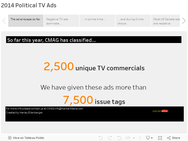
With Tableau, telling engaging stories with data is easy. What’s the balance—or lack thereof—in negative and positive political ads? This dashboard examines this question from many angles. Created by Harley Ellenberger at Kantar Media, the visualization shows negative ads are on the rise. The data also shows there is remarkable coherence in the messages promoted by negative ads. Explore different political races by hovering over bubbles and examine ads by various program types.